I’m a stereotypical first-born: Type A, ambitious, overachiever. As you may have already read on this blog, my brother and I are very different creatures. He’s the creative one. He’s an accomplished artist (you can check out his work here), and I’m immensely proud of him. That doesn’t stop the competitive older sister in me from coming out from time to time.
I’ll never be as good a painter as he is, but that fact didn’t stop me from trying. So when the folks at Paint Nite asked me to try out one of their painting parties I jumped at the chance. Paint Nite has become a Boston (and ‘burbs) bar staple over the past few years. At its core it’s a series of laid-back night of drinking and painting held at different Boston area bars and restaurants several nights a week. You can check out their website to see their schedule, sample paintings and to sign up.
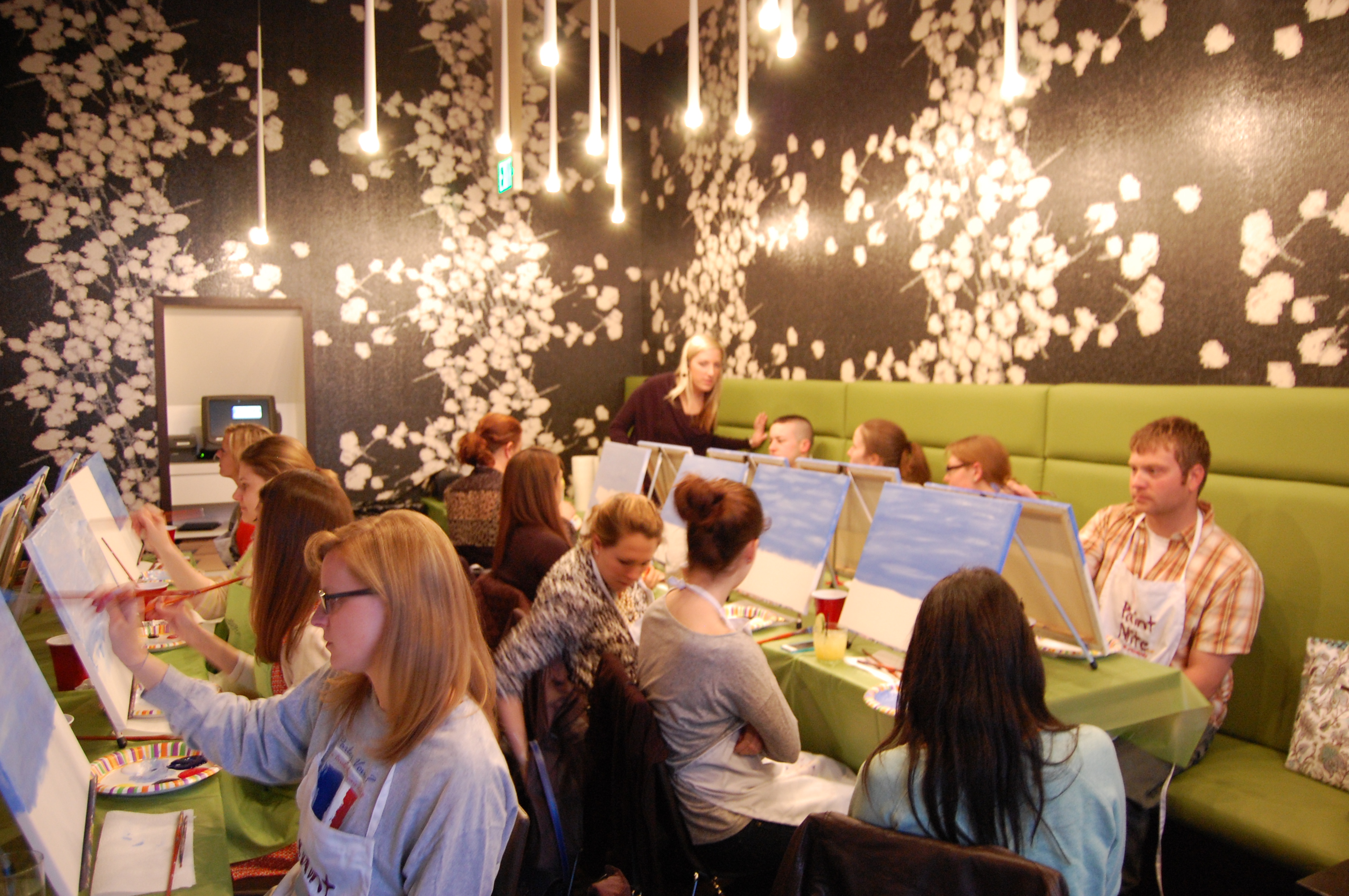
Let the painting begin
When it came time for my friend Diana and I to choose when and where to get our paint on, we did what anyone with discerning taste would do: we chose our location based on what we would be painting (their schedule is organized, not just by date and location, but also by painting and artist leading the class). The prettier the better. There are dozens of painting sessions to choose from, and in the end we chose a sail boat scene. We arrived at Basho and took two front row seats, I figured I would need an unobstructed view of our instructor (and more importantly, her canvas) if I was going to create something with even the slightest resemblance to what I was supposed to.
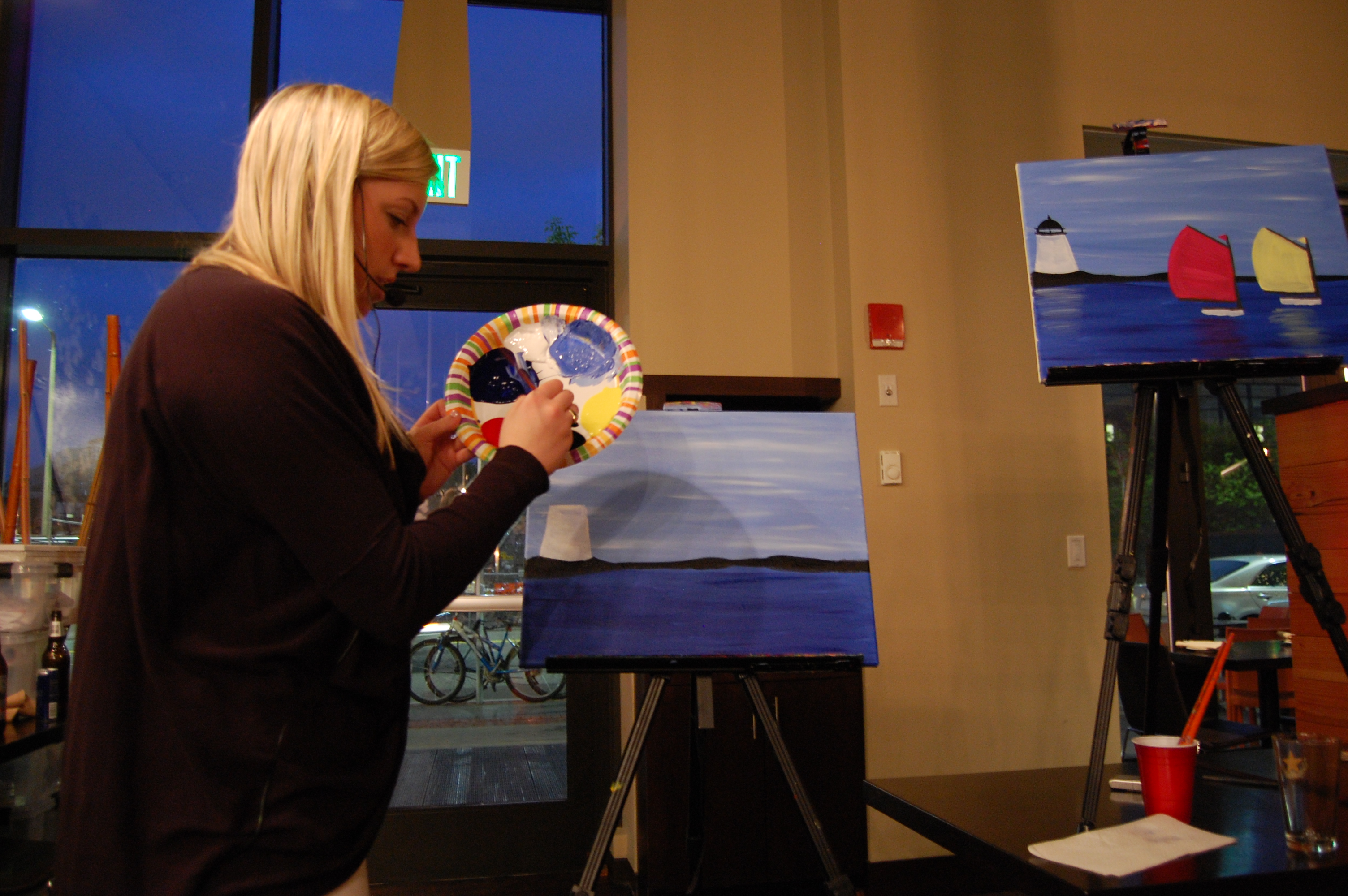
Erica shows us how it’s done
My first clue that this would not be a dark, hipster, artsy night was the artist who would be leading us in our sailboat soiree. Erica Pearson was cute, personable and not dressed in all black. She led us step-by-step through the painting, pausing to work her way around the room as we completed the water or a sail. I had my doubts, but it was actually fool-proof, literally. My stick figures are nothing to write home about, but whether it was Erica’s explanation or demonstration (or maybe I was touched by divine artistic intervention) I was able to paint the heck out of those sailboats, the water and even the reflection of the sails against the water. The latter was the most difficult part of the painting and required a very specific water-to-paint ratio on the brush. I may have let out a squeal of frustration, but Erica and Diana we able to talk me off my oil-paint covered ledge.
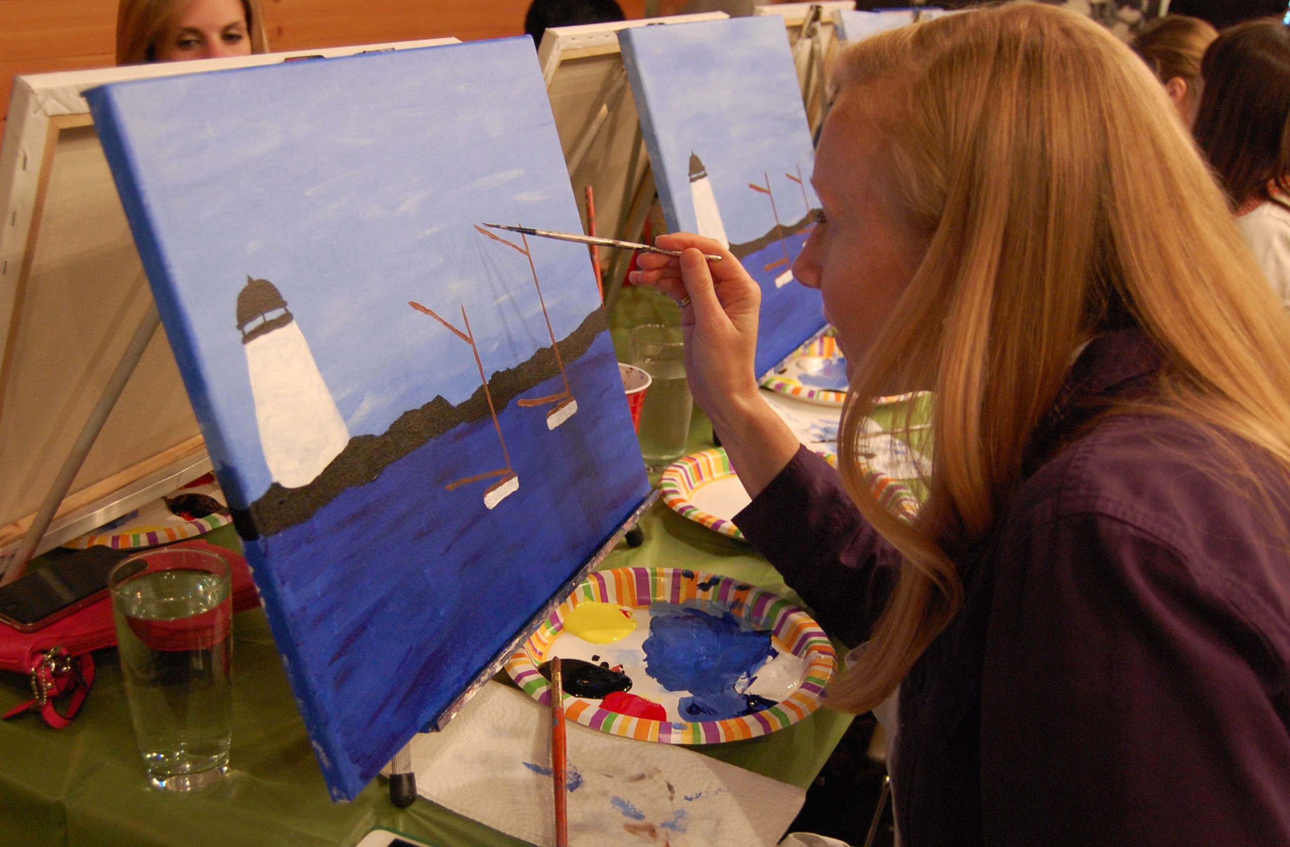
I was really concentrating.

My lovely friend Diana with her work of art.
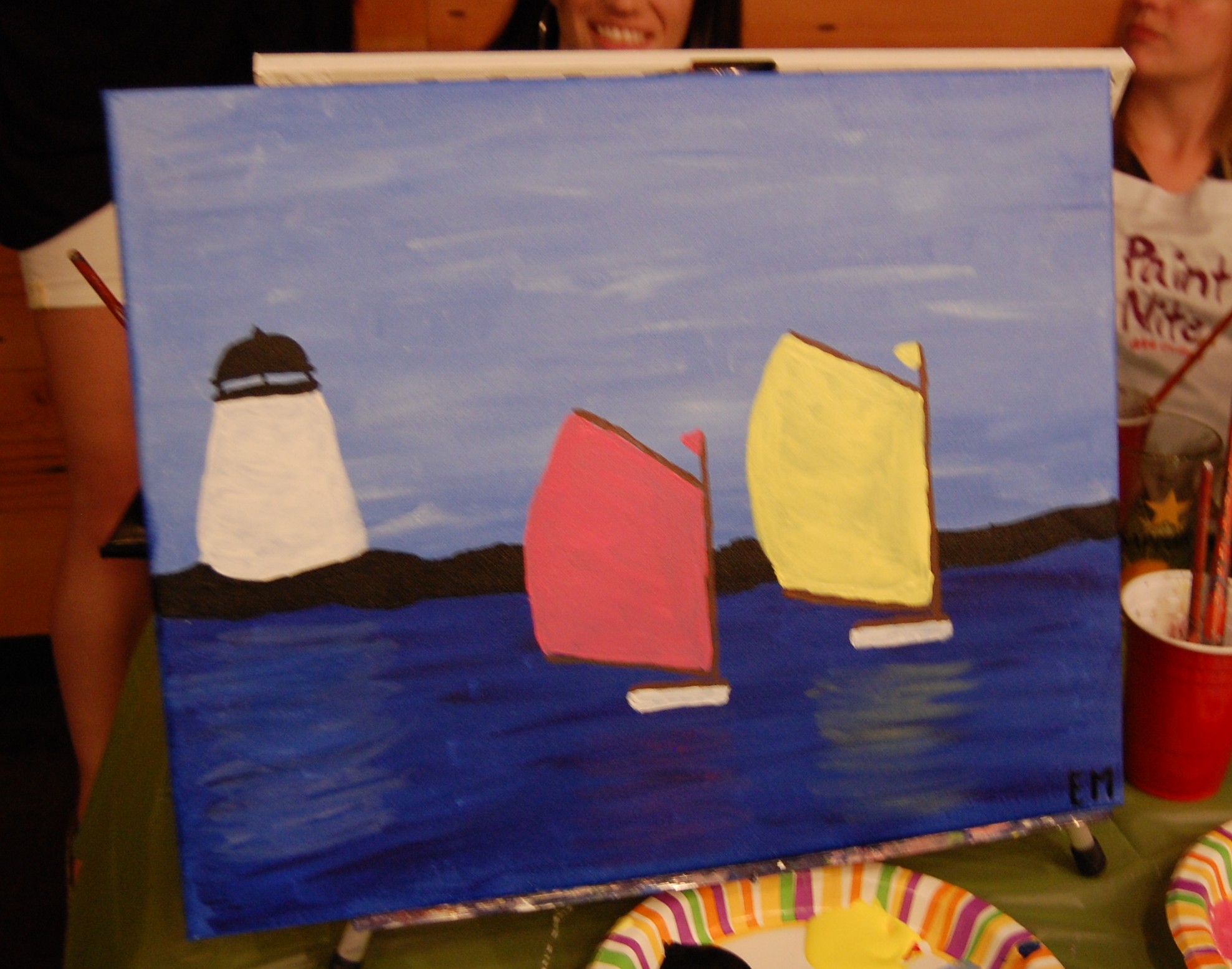
The finished product
I was really happy with the end product, and that I got to spend a night catching up with a dear friend. But because I am über competitive, I couldn’t just be satisfied with my painting. I had to see what a real artist thought of it. So I asked my aforementioned talented brother, Daniel Mahlman, to critique my sailboats. Here’s his dispatch:
“The colors are a little generic. Meaning the actual colors you are seeing are more complicated in real life than you have them; getting the actual colors in the right shapes is what makes your painting look like the thing you’re looking at. That said, just as a painting, I kinda like it. Except the ocean color. Water is almost never that color of blue, and is never that color blue all over. I would revisit it and look for some darker greens and reds in the water and look for variation so that it is not the same color all over. Sorta reminded me of this painter, Milton Avery.”

A piece by Milton Avery
Let’s skip the “generic” part; that’s a fair criticism, there were a few dozen of us painting the same exact scene, so it’s certainly not original. Let’s focus on the part where he writes that he “kinda likes it!” He can even see similarities between my technique (can I call it that?) and the Milton Avery piece above, and that’s a compliment. I think? (his piece is kinda simplistic as well, if I do say so myself)
Paint Nite is tons of fun for people of all levels of artistic inclination. Through the end of July, they are offering my readers a 15% discount. If you live in, or around Boston, and want to commune with your inner artist, use the code greatwidepainters when you sign up to received this discount!
Paint Nite allowed me to spend a night with them at no cost, but as always, all the opinions expressed on this blog and authentically my own. Thanks to Daniel Mahlman for his generous feedback.

I also went to Basho and I also had Erica as my instructor! She makes it look so easy. I felt myself getting competitive too. It was fun to try!
Looking at the 1st image, ‘Let the painting begin’ I have something to add to the conversation. I lived a year in Japan on an independent painting program when I was a junior @ the Kansas City Art Institute in 1974. I remember meeting an American from Seatle, WA who was teaching English. She told me that she gave her class a creative writing assignment. Out of a class of 30 students, 26 wrote about the beauty of the Plum Blossom, 3 students wrote about the 1st cherry blossom and one student wrote an independent essay. This teacher commented to me that this same class assignment in America would have had 30 essays of different topics. Looking at the picture posted why is everyone painting the same image? just saying